Explore Joseph Wakerley's journey from Maya to Blender, resulting in the stunning 3D artwork 'Baroque Flowers 2024 Redux', inspired by Flemish Baroque painting style.
INTRODUCTION
3D artist, former and repeatedly unretired graphic designer, I am Joseph Wakerley, currently living in Sheffield, UK, but forever an Essex boy.
I took up 3D animation over 20 years ago when my father introduced me to Autodesk Maya (then Alias Wavefront Maya 4.5), where tutorials came in the form of expensive DVD’s with dreary monotonous narration. It's amazing that I stuck with it, but I did—for about 15 years—working on and off as a freelance 3D artist (mostly in product visualization), while also working full-time as a graphic designer, against my will, just to sustain my motorcycling addiction.
I transitioned to Blender during Covid in 2020, and within about two months I was making work far better than anything I had ever made in Maya. I put this down to the amazing community of Blender users and tutors with considerable passion and creativity for their craft. I, like many, started with the Blender-Guru Donut tutorial and I’ve never looked back.
INSPIRATION
I had previously made a version of this illustration in 2022 called, "Baroque Flowers Still Life".
The same influences applied this time around, but I obviously used the 2022 version as a starting point with the objective of using this subject to test and review my progression as a 3D artist.
Based on the Flemish Baroque painting style from the 16th and 17th centuries, I looked at painters such as Rachel Ruysch.


And Ambrosius Bosschaert.


I also looked at contemporary artists like Hannes Hummel. Hannes’s work is still a few steps above mine, and I can’t quite put my finger on how to make that last 5-10% jump to more accurate realism, but every year I get slightly closer.
I wanted to make steps to improve the lighting, composition, materials, and colour-grading. Paying particular attention to filling out the scene better with more than just a dark backdrop. The grading was important to better capture the Flemish painting palette, something I’m still not convinced I achieved 100%, but moving positively in the right direction.
PROCESS
Hardware:
- AMD Ryzen 7 5800x
- Nvidia RTX 3070Ti
- 32GB RAM
Software:
- Blender 4.0/4.1
- Lightmap HDR Light Studio
- Adobe Photoshop
Add-Ons:
This is a departure from my normal macro-photography style product visualization, and I used more stock assets and less manually modeled geometry in order to cut time. Textures were redone for the most part, as I often find stock models have incomplete ‘PBR’ textures. I personally disliked the overuse of stock assets, as I thought it was ‘cheating’ but found as I worked more in graphic design that results were all that mattered to clients. In this case, I took the ‘what would a photographer do’ approach.
My goals for improving the 2022 version:
- More focus on making the colours match the baroque 17th century Flemish painting style. Which includes higher contrast and deeper, darker black areas. Slight over-saturation of the bold colours to contrast against some pastel colours of the flowers.
- This was my first time using the AgX ‘Punchy’ view transform. I like the AgX view transform, especially how it more accurately deals with bright lights and subsequently what that does to saturated colours. However, the ‘Punchy’ contrast type tends to lose/crunch a lot of the detail in the bright and especially dark areas. But with the appropriate considerations, it works well for this style.
- More natural lighting, a wider view, to give the space more life and purpose. It is a ‘real’ setting and not some closed-off photoshoot.
- Stop relying on dust motes and god rays. I want to get away from relying on extra layers of post-processing type ‘screen-clutter’ to cover up inadequacies.
- Textures and materials: Make the textures and materials more believable, particularly when looking at the flowers and fruit. I maybe didn’t achieve this as well as I’d have hoped, but you get away with more considering the wider camera lens. Too far away to tell. Maybe in 2026 when I redo this again I would like to make the flowers myself, scanning and photographing everything manually.
Lighting
There is one big key light, simulating the sun from the left, and a fill light from the right. The HDR image generated from HDR Light Studio also features a very low-intensity image of a room. I have found recently that when trying to emulate more realistic scenes, only having individual light sources creates a ‘black void’ appearance to the reflections, as the objects have nothing to reflect but the vast empty space of your Blender scene/HDRI. The efficient way around this is to use a very low-intensity image of a room as the base layer of your HDRI. While this may not seem relevant when your scene doesn’t contain highly polished reflective surfaces, it does make a noticeable difference towards a more natural look across your scene.
I did experiment with gobo lights and had planned on possibly doing a series with hyper-focused areas of light and creative shapes playing out across the scene. While these did look interesting, they were too busy and distracting and would require considerable time investment for a more complete series. The clear separation of the foreground elements on the table against the backdrop was more important to me for this one image.
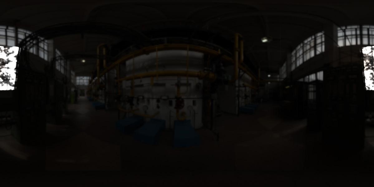
A low-res, 8-bit preview of the generated HDRI map. It was a surprisingly simple setup, but simplicity often is the best solution
Iterations
Approximately 22 versions were created, a lot more than I would hope to create on commissioned work, but I was experimenting and having fun. My process often involved taking a render into Photoshop, post-processing it, then scribbling notes out before going back into Blender for the next go at it. Here is a tidied-up version of what that generally looks like:
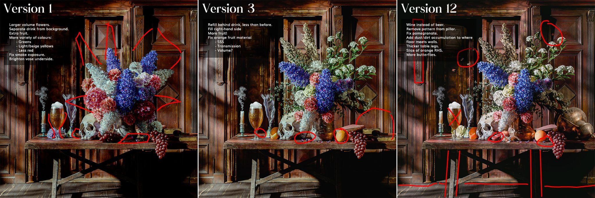
Versions 13-18 were mostly grading and lighting changes, going against the voices in my head and making the image increasingly darker, with the very last few versions being so minor in difference they’re not worth mentioning.
When working on personal projects, I often share different stages with colleagues, friends, and family. A new colleague of mine helped quite a bit with composition, so thanks Anthony.
Composition & Colour
Composition and colour have taken a big step since the 2022 version, with the inclusion of a fully filled background, the previously mentioned AgX view transform, and general improvements. I did spend a lot of time on colour-grading in Photoshop, and while it is better, I’m still not 100% happy with it.
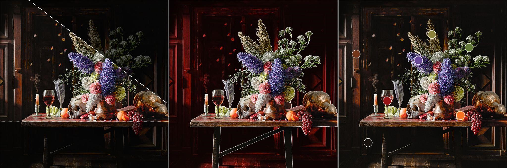
Drawing the eye, separating the background, and grouping the colours
Colours were banded into six main groups (plus a very dark background shade), then dispersed across the image with the more saturated colours centred around the flowers. I had difficulty creating a visual that simplifies how I view colours for this type of illustration, but essentially it boils down to:
- Higher saturation colours for the main subject.
- Use reds and oranges as accents/tertiary colours.
- Approximate brown/red to black gradient for the back wall and floor to contrast against the foreground.
Composition and drawing the eye changed with the lighting. If you look back at version 1 in the image further up, you will see that while the gobo lighting is nice, it's too bright for this theme, and the shadows create distracting patterns across the wall. So I simplified it and focused on illuminating the flowers while keeping the wall directly behind it in darkness to create that separation and depth.
If/when I decide to revisit this topic again, I’d like to scan the flowers myself and make attempts to animate this. Possibly with the flowers wilting during a day-night timelapse.
Small Details
The butterflies are animated to give the motion blur; this was a simple noise modifier on the transform keyframes. I only wish motion blur was visible in the viewport render previews.
The smoke, same as the 2022 version, is just a texture image with alpha on a plane.
The small little highlights on the right of the flower pot and on the underside of the copper jug far-right are small, hidden gobo spotlights from the Gobo Light Textures add-on. While obviously technically unrealistic, I feel it gives a little flair to the theoretical light-bounces from those objects. I made sure to keep the white/brightness levels (roughly) in check in relation to the rest of the image.
Materials
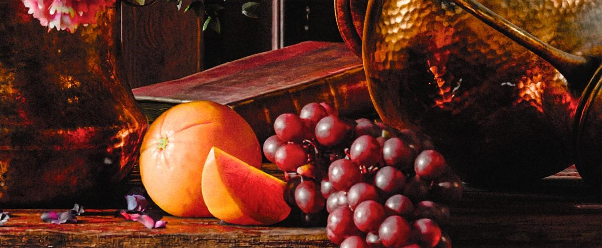
I continue to learn more about materials and how I can best represent them in 3D, balancing realism and creativity where necessary. Getting the fruit to look good in this project was quite challenging, having to paint transmission and subsurface scattering maps for the orange and orange slice materials. You’ll notice that the orange slice allows light to pass through it, more so at the thin tapered edge, while also maintaining density to the veins. Small details that no doubt get lost when viewing the wider image, but it’s all part of learning.
Getting the material values of the flower petals was very difficult, especially as the stock model has no thickness. I experimented with using a solidify modifier and adding subsurface scattering/transmission, but this didn’t work as I’d hoped. For the next version, I will scan the flowers myself and make a more complete model. Same goes for the backdrop, should I find a suitable location.
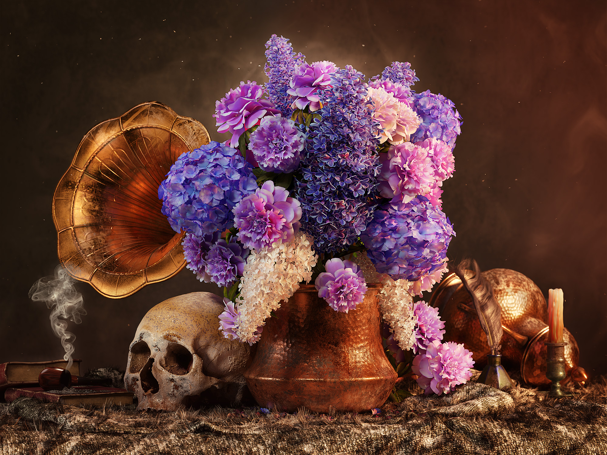
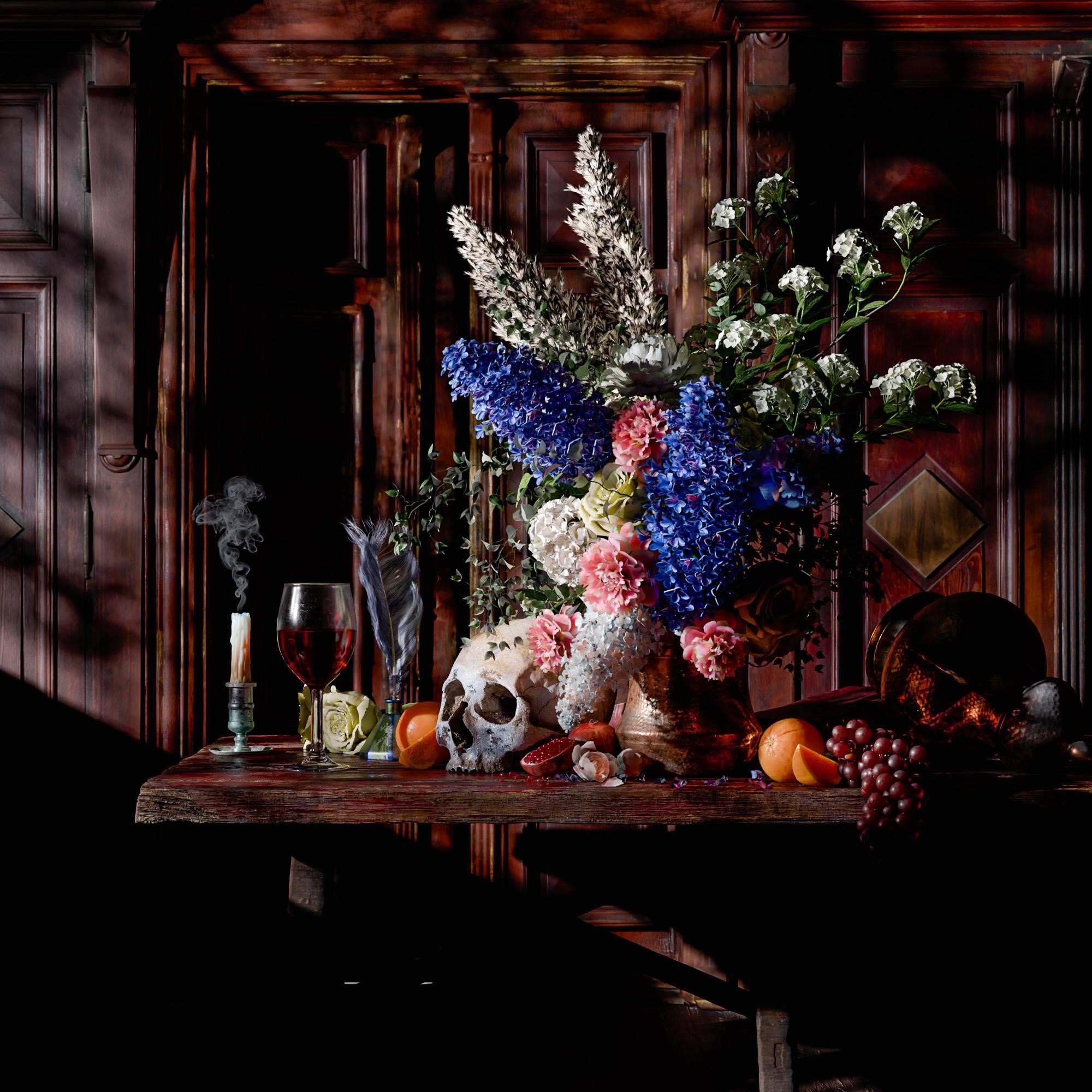
RENDER: Baroque Flowers 2024 Redux

Main final render
Moonlight final render. The gobo lighting is a bit too busy and I consider this incomplete, but worth a mention.
Viewport render
Thank you for checking out my article. Don’t hesitate to ask any questions on my social media. Have a great day!
About the Artist
Joseph Wakerley is a 3D artist living in the UK, with a passion for motorcycles.